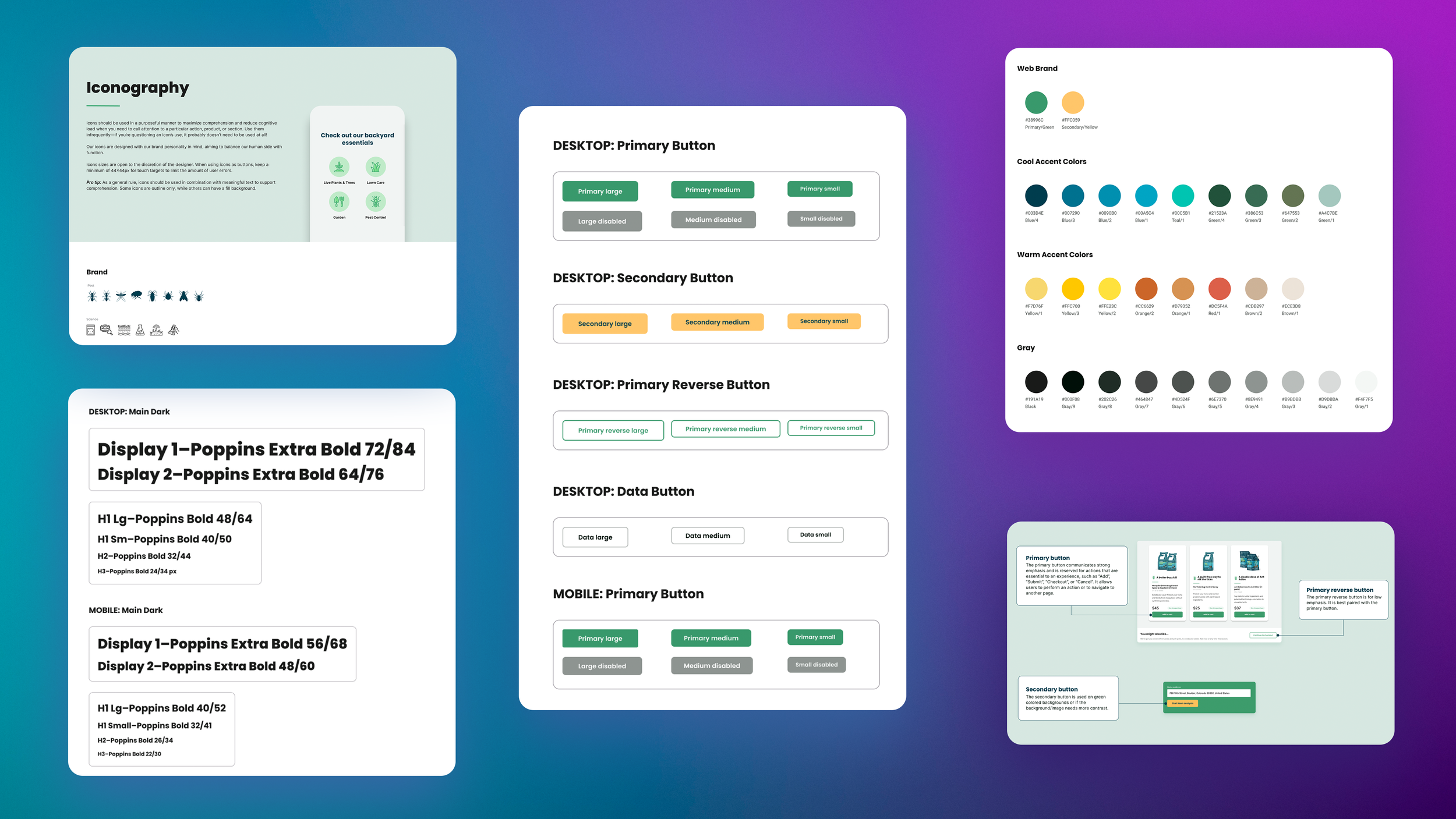
Design System Case Study
Working at a startup with no design team, I saw a need for a design system. As the company grew, having standard design guidelines would allow us scale while maintaining consistency throughout the site.
With the support of my manager, I was given two sprints to create the beginnings of a design system.
Client: Sunday
Role: UI/UX Designer
Contributions: Created components and design tokens, Site audit
Tools: Figma

Where to start?
Research
I started with heavy research. I read articles and reviewed the design guidelines laid out by other brands including Google, Adobe, Shopify, Salesforce, etc.
Audit
Next, I conducted a site audit, making note of the reusable components we used on our site and grouping them into categories. There were dozens of buttons styles, incorrectly applied font weights, and single-use icons everywhere. I also found areas where our site didn’t pass accessibility standards.
Edit
Next came the most time-consuming part. Narrowing down the colors we used, including multiple shades of similar green, and creating naming conventions for different components.
Evolve
There is now a good design system in place to continue building on. It will continue to evolve. As new designers join the team, it is up to us to continue to add to the library as new components are built.